![]()
The 3 keys to making online GIS friendly & intuitive for a public audience
Joy Bonaguro, Interface Designer/Research Analyst, [email protected]Abstract
Online Public Participation GIS are by definition designed for use by the public. But, paradoxically, web-based mapping applications require complex interfaces that are unfamiliar to the public. So, how can online mapping interfaces be made as friendly and intuitive as possible? By following three key principles drawn from the field of Human-Computer Interaction: visibility, affordance and feedback.
Visibility is how clear the relationship between an action and its effects are to the user. On a TV remote there is a button with a label next to it that says 'On.' Users understand the button controls the power for the TV.
Affordance is when the features of an object allow the user to infer how to use it. The button is round and concave. Users infer that the button should be pressed.
Feedback is the response a system gives that informs a user whether the action they took actually worked. After they press the button, a picture appears on the TV set.
Every day people rely on these three principles to change channels, open doors, and type on their keyboards. This paper will address how these principles are used to design online mapping interfaces that capitalize on everyday human capacity.
Introduction
Online mapping systems are inherently complex. In Public Participation GIS (PPGIS), non-experts depend on using these interfaces to support decision-making and advocacy. It is a challenge to design online mapping systems that are robust enough to support the information needs of the user, but are also friendly and intuitive to use. Techniques from the field of Human-Computer Interaction (HCI) can be employed to reduce the complexity of mapping interfaces. Simply put, HCI is the study of how humans interact with computers, and how to design computer systems that are easy, quick and productive for humans to use.
How HCI became important in computer interfaces
When computers were first developed, they were large and expensive, and only available to scientists or government experts. It was more efficient to spend time training people to use the machine, than to design the machine to be easy to use. Early interfaces reflected this with command-line entries that depended on the user knowing the specialized language of the computer. Although computing speed was increased, the command-line method put a large burden on the user’s time and memory (Preece, 1994; IBM). If computers were to appeal to an audience beyond expert circles, friendly and intuitive interfaces needed to be designed. Thus emerged the field of Human-Computer Interaction.
The need for HCI techniques in PPGIS
The field of PPGIS is experiencing a similar growing pattern to computer interface development. GIS software was originally manufactured for expert users in the sciences, government and higher education. In addition, the market is currently largely dominated by one player, which decreases the competition for friendly software. And because GIS software is not intuitive, professionals whose work requires GIS skills typically learn how to use it through classes, books, and workshops.
Making GIS intellectually and technically accessible to non-experts is aligned with the philosophy expressed by the field of PPGIS. According to Public Participation GIS Guiding Principles, "Public Participation GIS…
Promotes development of software that is accessible to broad acquisition and ease of use;
Endeavours to involve youth, elders, women, First Nations and other segments of society that are traditionally marginalized from decision making processes;
Enables public access to cultural, economic and biophysical data generated by governments, private sector organizations and academic institutions;" (Aberley and Sieber)
Difficult to use systems place burdens on or exclude people who do not have the time and/or resources to learn them. Providing access to data is not enough. The interfaces used to access the data must be easy to use so that the public can focus on using the information in the system rather than struggling with the system itself.
The field of HCI
is more than 40 years old, with a rich literature and mature foundational
concepts. In this paper the basic principles of HCI will be applied to
the emerging field of PPGIS, online PPGIS in particular.
The role of visibility, affordance, and feedback in designing interfaces
There are three main principles in Human-Computer Interaction that can inform the development of friendly and intuitive online mapping interfaces. They are visibility, affordance, and feedback.
Visibility
Visibility is how clear the relationship between an action and its effects are to the user. When someone is using a system they have a specific goal or task in mind that they want to complete and are looking for controls that will help them. Visibility should answer: what will happen if this control is used? When the functionality that is needed to achieve a goal is not visible, a user cannot operate the system as effectively (Norman, 1988, pp.8).
Ideally there should be one control per function (Norman, 1988, pp. 22). When a single control operates more than one function, the relationship between control and function becomes more difficult to learn and easier to forget. For instance, on my alarm clock, the minute and hour buttons set both the time and the alarm. In order to change the wake time the alarm is set for, I have to hold a third button down, while pushing on the minute and hour buttons. When I go to change my wake time I sometimes inadvertently change the actual time as well. Without realizing it, I have released the pressure on the third button. Of course, I don't find out till the next morning when I've woken up earlier or later than intended.
The relationship between the control and function can also be made more explicit by modifying aspects of the control such as the shape, its location in the interface, and labeling.
Visibility is relevant to online mapping interfaces in many ways, especially with respect to tools. On the web, the cursor is conventionally limited to clicking on underlined links or buttons. In contrast, online mapping interfaces are more similar to software programs as they often require users to use the cursor to select tools and then use the cursor in a novel way (i.e. the user selects the "identify" tool, then has to click on a geographic point on the map). In order to use mapping tools effectively, users must understand what each individual tool controls and how to use the tool.
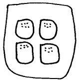
A
real-world example of visibility
The switches that
control the windows in a typical car are an example of good visibility.
In diagram A below, there are four switches aligned 2x2. The four switches
are mounted near the front of the driver's side armrest (where the driver's
hand would rest). Each switch corresponds to a single window according
to its location. The upper left-hand switch controls the driver side window,
the lower left-hand switch controls the rear left passenger and so forth.
Diagram
A. Switches
for operating car windows
Affordance
Once the principle of visibility helps users identify which control they want to use, they need to figure out how to use it. Affordance is when the features of an object allow someone to infer how to use it. It answers questions such as: should this switch be pushed or pulled?
The concept of affordance stems from Gibson's ecological theory of perception. Human beings do not see things in their environment by accident-information is perceived in order to perform some action (Gibson, 1979).
The concept of affordance is particularly relevant in online mapping systems, which are complex environments that are unfamiliar to the layman. The more people can infer how to use the system due to the affordances that are designed into the controls, the lower the learning curve and the greater ease of use (Amant, 1998).
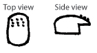
A
real-world example of affordance
The car window switches
mentioned earlier afford two types of actions: a push and a pull. In diagram
B below, each switch has a series of bumps at the front of the switch.
These bumps afford pushing down on the switch. The downward motion logically
lowers the window. The side view of the switches shows a rounded hook
that affords pulling upwards, which in turn raises the window. The distinct
feel of each of the actions also prevents the need to look downwards while
operating the vehicle.
Diagram
B.
Top and side views of car window switch
Feedback
Once users understand what a control will do and how to operate it, they want to know if it works when they use it. Feedback should answer: did the control work correctly, if it did not work correctly what is wrong and what can be done next (Apple).
Feedback is the most straightforward of the concepts to incorporate into an interface, because it is usually the completion or result of the action. If someone wants to pass through a door, they find the knob, infer that it will open the door, and turn it. The feedback is the door opening. It is less obvious what the user would do if the door did not open. Maybe the knob is broken or jammed (there is a jingly sound when the knob is twisted-that is auditory feedback). Or if the door was pushed and the door pressed back, they should try pulling the door.
When using a computer interface, real world feedback does not exist-it must be designed into the online mapping system. For example, someone is using their local online mapping system and requests to see schools in the neighborhood where they work. When the map reloads, centered on the neighborhood, there are no schools visible. Feedback should tell the user that there are no schools in that neighborhood and they should try zooming out in order to see a larger area. The interface should also provide the user with an opportunity to give feedback to the system. Perhaps the user works in a school in that neighborhood, and it was not in the database.
A
real-world example of feedback
If someone pushes
the window switch for the car discussed above, they receive immediate
feedback as the window lowers. If the window does not lower, the switch
is not operating properly. Users might consult their car manual or bring
the car to the shop. In contrast, computer interfaces provide a unique
opportunity to give the user immediate feedback on what is wrong or what
they can do next.
Using visibility, affordance, and feedback in online mapping interfaces
In online mapping interfaces, there are often out-of-the-box designs for common controls. For the purposes of this paper, we'll examine two common controls, zoom and pan, and how the principles of visibility, affordance, and feedback are employed in the Yahoo! Maps interface to make the controls more friendly and intuitive.
Changing zoom
The control for changing the zoom level in an interface is most commonly a tool that the user selects with their cursor (Step 1 below), clicks and drags the same cursor to draw an outline of the area they want to see in more detail (Step 2), and releases the mouse button in order to zoom to the selected area (Step 3). This is not a natural interface action for a non-expert user and uses the cursor to perform two distinct types of actions (select the tool and draw a box).
Diagram C. Actions for changing the zoom level for an out-of-the-box solution
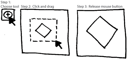
Diagram D below illustrates Yahoo! Maps interface solution for changing zoom that does not require selecting a tool and learning how to use it and does not require the cursor to provide more than one control. As shown in diagram D, the user needs only one click to change the current zoom.
Diagram
D. Principals
of HCI in Yahoo! Maps zoom control
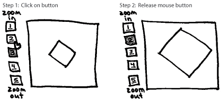
All five zoom levels are visible to the user. The stacking of the zoom levels and the numbered labels create a sense of progression from top to bottom. The words 'zoom in' and 'zoom out' tell the user what function is controlled by the progression. The darkened zoom level 3 tells them that it is the current zoom level.
The underlining of the numbered zoom levels creates a perceived affordance of meaningful click-ability. You could also design buttons with dimension that afford pushing. The arrow changing to a hand as it passes over zoom level 2 is another indicator of click-ability. These affordances are removed from the current zoom level, 3.
If the user clicks on level 2, several pieces of feedback happen simultaneously. The map view changes, the number 2 is no longer underlined, the box around the 2 is darkened, and zoom level 3 becomes available to use (underlined and lightened).
Panning
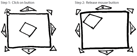
Panning is another common functionality that is complex in most out-of-the-box solutions. First the user must click on the pan button (step 1 below), click and drag the cursor on the map (step 2), then release the mouse button in order to shift the map view (step 3).
Diagram
E.
The out-of-the-box pan tool solution
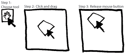
Diagram F below illustrates Yahoo! Maps method of pan that does not require the user to learn a new tool. The user clicks on the appropriate button in order to shift the map view.
Diagram
F. Principles of HCI in Yahoo! Maps pan control
All eight options for panning are visible to the user. The placement of the pan controls around the map and the arrow shape indicate movement in the appropriate direction. The arrows are also labeled with the appropriate direction.
When the user's mouse passes over the pan buttons, it changes to a hand, affording click-ability. The only time a direction should not be clickable is if there is no more land area to pan over.
Feedback occurs when
the map shifts in the appropriate direction.
Adding other functionality
For each piece of functionality that is added to the mapping interface, the designer should be able to articulate why each control's function is visible, what affordances are employed so that users can infer how to use it, and what feedback is given when the control works correctly and what feedback is given when something goes wrong.
Conclusion
In Public Participation GIS, there is a commitment to provide access to data and tools for decision-making to a wide and diverse audience of non-experts in GIS. Fortunately, the field of Human-Computer Interaction offers a structured approach for designing online mapping interfaces to correspond with everyday human capacity, making these interfaces friendly and intuitive for all audiences.
References
Aberley, Doug
and Renne Sieber. "Public Participation GIS (PPGIS) Guiding Principles."
Urban and Regional Information Systems Association. Retrieved 27 May 2004:
http://www.urisa.org/PPGIS/2003/papers/PPGIS%20Principles2.pdf
Amant, Robert St., 1998. "Affordances for acting in direct manipulation interfaces." North Carolina State University, Department of Computer Science, Technical Reports: January 28, 1998.
Apple. "Human Interface Design Principles." Apple Developer Connection. Retrieved 27 May 2004: developer.apple.com/documentation/UserExperience/Conceptual/OSXHIGuidelines/index.html
Gibson, J.J., 1979. The Ecological Approach to Visual Perception. Houghton Mifflin, Boston.
IBM. "UI
evolution." IBM Corporation. Retrieved 27 May 2004:
http://www-3.ibm.com/ibm/easy/eou_ext.nsf/Publish/12
Norman, D. A., 1988. The design of everyday things. New York: Doubleday.
Preece, Jenny
et al, 1994. Human-computer interaction. Wokingham, England; Reading,
Massachussets: Addison-Wesley Publishing Company.
![]()
|
Greater New Orleans Community Data Center
Last modified: July 16, 2004 |