![]()
Home
![]() Mapping
Mapping
![]() Design
recommendations
Design
recommendations
Design recommendations
for online mapping systems
How to use this page
This page is set
up by naming & defining each map function or element within the following
3 groups:
- Navigating the map
- Interacting with the map
- Cartographic items
Following the definitions, each function or element is given a set of design recommendations with supporting rationale. It is followed by an example that illustrates the design recommendations.
1. Navigating the map
| Function | Definition |
| Zoom | This magnifies or reduces the scale of the map. |
| Pan | This changes the map view without modifying the zoom level (scale). |
Pan bars |
Bars or buttons surrounding the map that when clicked move the view of the map in the corresponding direction |
Pan map |
A small box that represents the full map. Pan maps usually 1) contains an indicator of the area that the large map view is centered on or covering & 2) provides navigation through re-centering the large map view |
Re-centering |
If you click on the map, the map re-centers where you clicked. |
![]()
Zoom
Magnify or
reduce the scale of the map
| Design recommendations | Rationale |
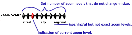
| Use a set number of zoom levels | Set zoom levels facilitate user decision making & eliminate the need for extra tools. |
| Employ meaningful but not exact zoom levels | Levels called street, city & region are more useful than 1, 2, 3 or nothing. However, exact labeling of zoom levels creates user expectations that the technology cannot satisify. |
| Include an indication of the current zoom level | The user should always know where they currently are & it establishes good feedback. |
An example that illustrates these concepts:
![]()
Pan bars
or buttons
Bars
or buttons surrounding the map that when clicked move the view of the
map in the corresponding direction
| Design recommendations | Rationale |
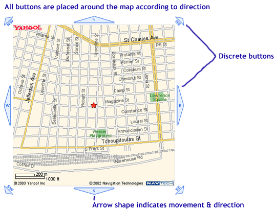
| Use discrete buttons for each direction | These are the most clickable & give the user a clear indication of the available options |
| Place the buttons around the map by direction | As the user moves around the map, if they want to pan in a direction, their eye & mouse are most likely already there. |
| Use an arrow shape for the button | The arrow shape indicates movement by pointing in the correct direction. |
An example that illustrates these concepts:
![]()
Pan
map
A small box that represents the full map
| Design recommendations | Rationale |
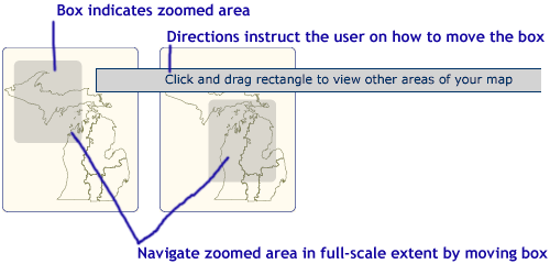
| Indicate the current zoom area | This contextualizes the area of the zoomed map by placing it within the full-scale area. |
| Allow navigation through the pan map* | This allows the user to refine their zoom area within the full-scale context. |
| Include directions for navigation | The notion of navigating within a small view of the map to change the larger map is not an intuitive html experience. |
An example that illustrates these concepts:
Additional
discussion of navigating the pan map:
One of the design recommendations is to provide navigation of the large
map through the pan map. I've seen this done in 2 different ways:
- The user clicks on the pan map & the larger extent is re-centered around the click.
- The user clicks & drags the box in the pan map to re-center the map.
| Method | Advantages | Disadvantages |
| 1. Click | *Matches the method used for re-centering with a click (see next navigation method below) | *Less
precise method for changing the current area *Does not show new area before reloading |
| 2. Click & drag | *More
flexible in terms of refining the map area before reloading *Shows the actual area that will be reloaded |
*Click & drag is more complex (a 2-step process) |
I currently recommend the 2nd method, but also recommend user-testing to determine with evidence which method is best or how they could be improved.
![]()
Re-centering
with a click
Click
on the map & the map re-centers around the click
| Design recommendations | Rationale |
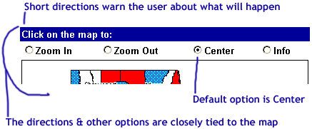
| This should be the default setting for clicking on the map | This response to clicking on the map is the most intuitive & capitalizes on Yahoo & Mapquest, familiar mapping programs. |
| Tell the user what will happen if they click on map | Directions should be included for any non-html navigation. |
| The warning should be close to the map | If it is too far away, the user won't see it & know what happened. In addition, if there are other options available besides re-centering, the user will not see them. |
An example that illustrates these concepts:
2. Interacting with the map
| Function | Definition |
| Layer selection & activation | The process by which the user selects or activates layers to be included in the map view. |
| Identify | The method that allows the user to access additional information about a specific location or geography on the map. |
|
The means by which information (which is not geographic in nature) about a geography is displayed or communicated to the user. |
![]()
Layer
selection & activation
Process used to select or activate layers to be in the map
For this action there are 3 different methods that can be used:
| Method | Number of layers added | Example |
| Checkboxes | Multiple layers at a time | |
| X boxes | 1 | |
|
HTML links |
1 |
Which
method is best?
The decision to choose one
of the methods should be based on the following considerations:
- User tasks-what will our users be doing to answer what questions?
- Map content-how are the layers related & to what degree do we want users adding layers?
- Usability testing-what method works best under actual use conditions with our audience?
- Technology decisions-what are the limitations of the technology in each of the methods?
Since we have not answered these questions, it's difficult to decide which will work best. However, we can look at the different methods & think about how they should be implemented.
Recommendations
The 3 methods have some common design recommendations & then below
are additional recommendations for each method.
Recommendations
for all 3 methods
| Design recommendations | Rationale |
| Include complete directions for adding or deleting layers | Directions should be included for any non-html navigation. |
| Include an indicator of what layers are currently on map | This avoids time wasted by user adding to map what is already there & provides a snapshot of map content. |
| Include the layer legend as part of the activation/deactivation method | The user can tie the activation/deactivation of layers immediately to what appears or disappears from the map. It's a strong visual cue. |
| Provide definitions for the layers | The user should not have to guess what the layers mean. |
| Definitions should be displayed through a pop-up window individually & a single page for all the layer definitions | The pop-up allows the user a short-cut to individual layers with ambiguous names. The single page allows printing & documentation. |
| Include enough space for long layer names | Abbreviations may not be meaningful to the user. |
| Do not give users the ability to turn off layers that are necessary for the map | Certain layers are necessary either by providing context or for supplementing other optional layers & should not be removed from the map. Furthermore, these layers should be separated visually from the other layers. |
Below are recommendations for 1) the checkbox and 2) the X boxes & HTML links.
1) Checkbox
recommendations
![]()
| Design recommendations | Rationale |
| Do not load new layers without user permission | Checkboxes imply users choose when to submit or change something. |
| Allow for adding more than one layer at a time | Checkboxes imply multiple selection (as opposed to radio buttons). |
| Phrase the submit button appropriately to task, i.e. Add layers to map, Add changes | Meets user expectation by matching verbiage to task & directs user attention to the map. |
2) X boxes & HTML links
recommendations ![]() ,
,
![]()
| Design recommendations | Rationale |
| HTML link & x boxes: minimize reloading time | Since these methods add one layer at a time, long reload times for each layer added would damage the user experience. |
| HTML links only: Provide a method for the user to remove layers that they have added | We don't want the back button used, & we want to reassure users that they can always remove the layer. |
![]()
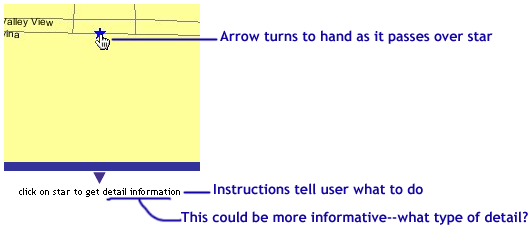
Identify
Method that provides access to additional information about places
on the map
| Design recommendations | Rationale |
| Use the hand-icon rollover to indicate something is clickable | Users understand that when the mouse changes from an arrow to a hand that it's clickable. |
| Include directions telling user to click | Directions should be included for any non-html navigation. |
| Tell users what is behind the click | It sets expectations & also leads the user through by using information scent. |
An example that illustrates these concepts:
![]()
Non-map
information display
How
information about a geography is displayed or communicated to the user
| Design recommendations | Rationale |
| Use pop-up windows to display the information | This stresses the fact that it is a new type of information & keeps the map in view. |
| Visually link the pop-up window to the map | It should be clear that the new window is part of the website. |
![]()
3. Cartographic items
| Function | Definition |
| Legends | An explanatory list of the symbols and/or geographies on the map |
| Labels | The display of the name of a point or location on the map. |
|
Scales |
An indication of the relationship between the distances on a map and the corresponding actual distances |
| Titles | A descriptive name for the contents of the map |
![]()
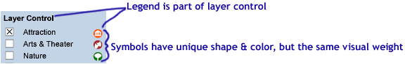
Legends
An explanatory list of the symbols and/or geographies on the map
| Design recommendations | Rationale |
| It should be visible at all times | Since the legend translates map symbols, it's necessary for understanding the map. |
| Integrate with layer selection/deactivation | This eliminates redundancy, as items on layer selection should also be in the legend. |
| Give legend symbols a unique shape & color | Shape is sufficient for differentiation, however, color adds an additional visual cue. Color alone is not enough. |
| Give the different shapes equal weight | Different weights imply a range of importance. Unless you wish to convey differing importance, the weights should be equal. |
An example that illustrates these concepts:
![]()
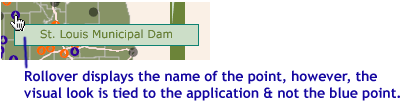
Labels
Display of the name of a point or location on the map
| Design recommendations | Rationale |
| Use rollovers for the label | This ties a name to each map point, without the visibility problems of showing every label at once. |
| Use the same color as the category of the point | This enforces the visual relationship between the point & what it represents. |
An example that illustrates these concepts:
![]()
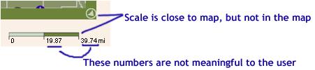
Scales
Indication of the relationship between distances
on a map and corresponding actual distances
| Design recommendations | Rationale |
| Alternate the size of the scale, hold distance constant | Distances are not meaningful if the distance represented by the scale changes according to zoom, i.e. 2.1 to .64 miles, versus a constant distance of 1 mile. |
| Offset scale from main map area | The scale is a tool for interpreting the map, not part of it. This also avoids visual confusion with the colors on the map. |
An example that illustrates these concepts:
![]()
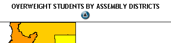
Titles
A descriptive name for the contents of the map
| Design recommendations | Rationale |
| Include one if at all possible | It clarifies the meaning of the map & narrows the focus of the user. It's also an opportunity to impart stricter vocabulary. |
| Place it above the map | In addition to being a standard placement of the title, it would hopefully be read before the users eyes went to the map. |
An example:
![]()
Home
![]() Mapping
Mapping
![]() Design
recommendations
Design
recommendations
![]()
|
Greater New Orleans Community Data Center
Last modified: January 13, 2004 |